Branding Psychology
The Psychology of Handwriting in Branding
Discover why the human touch of a pen stroke can build more trust than a thousand pixels.
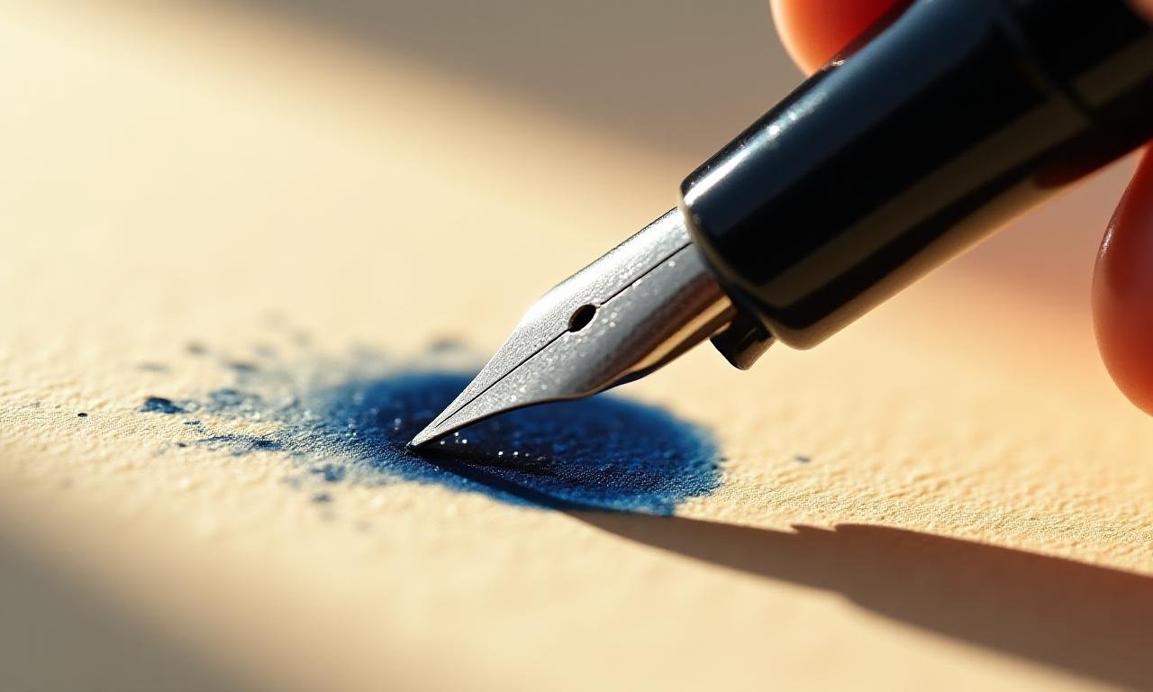
In an increasingly digital world, the craving for authenticity has never been higher. When we see a handwritten signature or a bespoke script logo, our brains instantly register a 'human' presence. Unlike the sterile precision of geometric sans-serif fonts, handwriting carries flaws, pressure variations, and unique rhythms that mirror the human heart.
Research suggests that handwritten elements in branding trigger a subconscious perception of craftsmanship and personal accountability. It says: "A person stands behind this product."
The Connection Between Organic Shapes and Emotion
Our ancestors interpreted curved, organic lines as signs of life and nature, while sharp, jagged edges signaled danger. In modern branding, the fluid curves of calligraphy tap into this primal comfort. These shapes allow for 'emotional breathing room' within a design.
Case Studies: The Script of Success
Consider the lasting power of icons like Coca-Cola or Disney. Their logos aren't just words; they are visual signatures. We explore three distinct ways brands use script:
-
The Heritage Script: Using classic copperplate styles to denote history and established trust.
-
The Modern Scribble: Casual, fast-paced handwriting used by boutique coffee shops or tech startups to convey approachability and speed.
-
The Brush Stroke: Thick, textured strokes that imply artistic passion and raw energy.
Balancing Readability with Personality
The greatest challenge in using handwriting for branding is the fine line between 'artistic' and 'unreadable'. To maintain professional standards, follow these three rules:
- Contrast is King: Pair a complex script logo with a clean, simple sans-serif for body text.
- Scaling Matters: Ensure the thin strokes of your script don't disappear when the logo is shrunk for a business card.
- Whitespace: Handwritten elements need room to flow. Do not crowd them.