5 Steps to Visual Consistency
Unlock the power of a unified brand identity to drive resonance and revenue.
The Cost of Confusion
In the world of creative consulting, your visual identity is the silent ambassador of your brand. When your social media looks different from your website, and your PDF guides feel like they belong to another company, you create "visual friction." This mismatched aesthetic doesn't just look messy—it hurts your bottom line by eroding trust and making your business appear amateurish.
Define Your Color Palette
Consistency starts with a limited, intentional color story. Choose one primary color to lead your brand, two secondary colors for support, and an accent color for calls to action. Stick to these hex codes across every digital and physical touchpoint.
Choose Your Typography Hierarchy
Limit your fonts to two or three families. Use a distinct serif for headings to convey authority or elegance, and a clean sans-serif for body text to ensure readability on mobile screens. Consistency in font sizing and weight is just as vital as the choice of typeface itself.
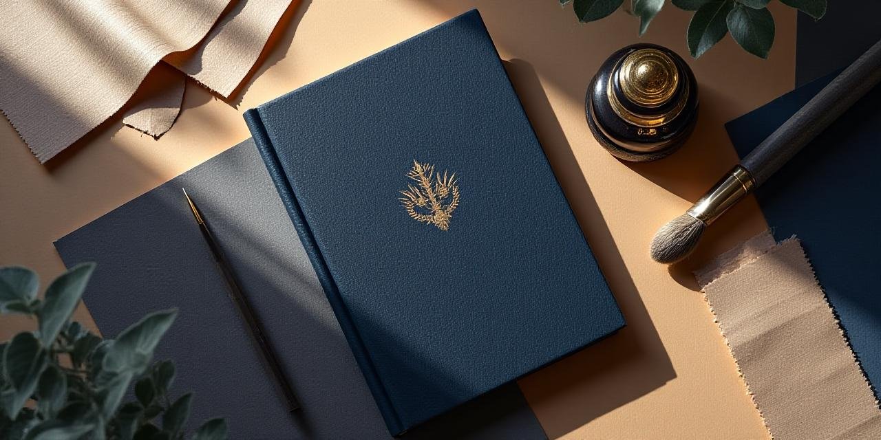
Create a Visual Mood Board
Before designing new assets, curate a collection of images, textures, and patterns that represent your desired "vibe." At CalliVibe Studio, we recommend including calligraphy-inspired textures to add a personal, transformative touch to your mood board.
Audit Your Social Media
Scroll through your Instagram or LinkedIn history. Does it look like a cohesive story or a collection of random thoughts? Remove posts that no longer align with your style and ensure your bio highlights and grid layouts follow your new hierarchy.
Create a Brand Style Guide
Document everything. A simple 3-page PDF outlining your logo usage, colors, and font rules ensures that anyone working on your brand—from assistants to agencies—produces work that feels like you.
Ready to Align Your Vibe?
Stop guessing and start growing. Our creative coaching helps you master visual communication.